A new version of Twitter?
15 Oct, 10 | by BMJ
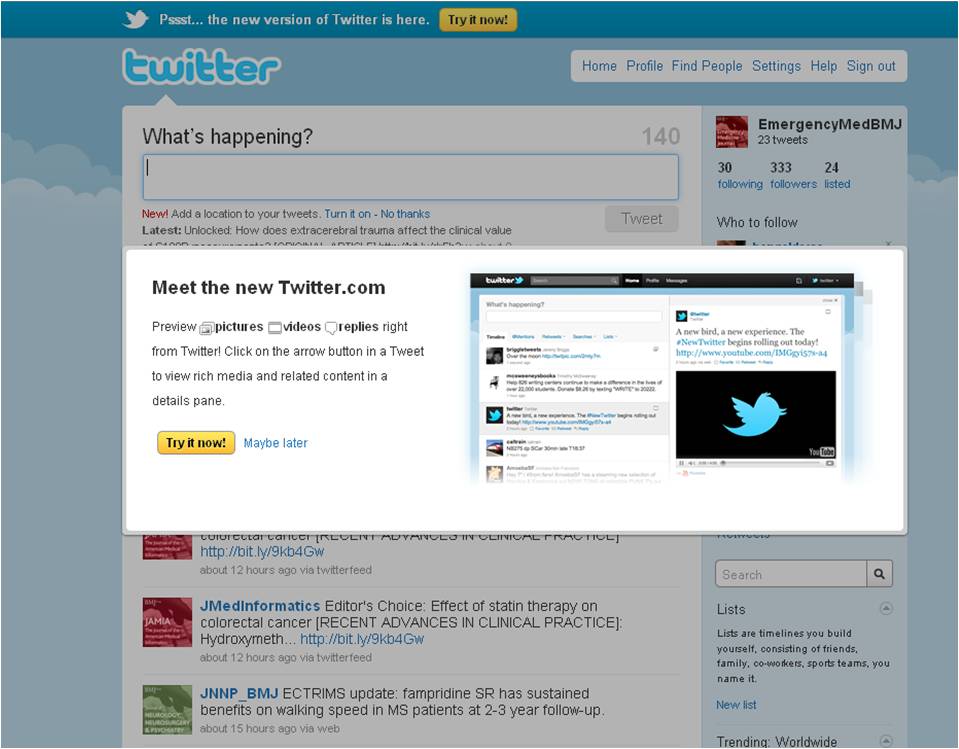
You may have noticed over the past few days that Twitter has been looking slightly different. That’s because the microblogging site has finally finished rolling out the new version of its web interface (a.k.a. the “New Twitter”) to all 160 million of its users in six different languages. For those of you averse to change, the option to view the old version of Twitter is still available (see screenshot below) but this will eventually disappear and all users will automatically be redirected to the new and improved Twitter.com. So, it’s time to familarise yourself with the new design.

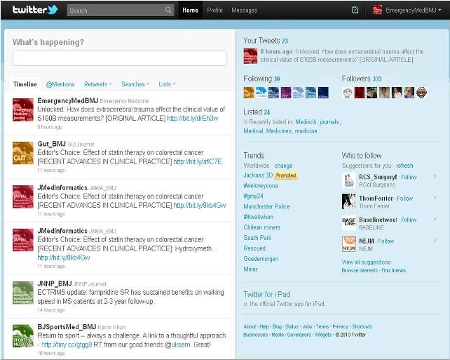
The New Twitter brings many innovative features to Twitter’s web interface. Most notably, it provides support for multimedia viewing directly on Twitter.com, which prevents users from having to click off-site to view images and video. Media content partners now include YouTube, Vimeo, Ustream, TwitPic, Flickr and 11 other firms. Multimedia content now appears in a sidebar beside a relatively traditional newsfeed.

The new interface also displays a slew of improved navigation controls, concentrated in a drop-down menu bar that runs across the top of the screen. Another big feature is the ability to view threaded conversations more easily on the Messages page. Other changes include:
- The screen is split into two panes, left is the tweet stream, the right is helpful information (video, photos, etc.)
- Click on a video link and it will play within the right pane
- If somebody posts with geolocation enabled, a map will show in the right pane
- Helpful profile information on Twitter users [e.g. profile picture] is displayed
So, how do I use the new Twitter?
This video will help you get to grips with the key differences between the old site and the new design:
http://www.youtube.com/watch?v=NshQFrpC2O4