Facebook News Feed: bigger images, greater control and platform consistency
15 Mar, 13 | by BMJ
As you may already be aware, Facebook is rolling out the first major update to its News Feed since the feature launched nearly seven years ago. As with every other change the site has made, the new design has been met with mixed reactions and hasn’t gone unnoticed by the media.
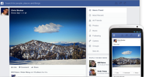
Facebook’s revamped News Feed gives the homepage a starkly mobile look, reducing clutter and lending more space to prominent photographs. It takes significant cues from the Facebook mobile apps for phones and tablets, adding a new side navigation bar and more white space.
- More prominent images
The new look is a drastic departure from the Facebook of old, which many users complained had become too cluttered. The focus on stories within the feed is now far more visual. Greater emphasis is given to images, which are now much bigger. Photos now make up nearly 50% of news feed stories and are front and centre.
Facebook says it is following trends on where design is headed and that trend seems to include big photos and a clean, navigable design. This can also be seen on other social sites (Instagram, Pinterest, RebelMouse) and even academic journals such as eLife and PeerJ.
- Greater control of feeds
As for the ‘feeds’ aspect of the News Feed, users now have access to more types of feed and greater control over how those feeds are displayed. Users can subscribe to different types of feed, including feeds from all friends, close friends, music, photos, games and those who a user ‘follows’.
- Mobile consistency across platforms
The new design was undoubtedly inspired by mobile. Understanding that more users are accessing Facebook from mobile, Facebook is focused on making the overall experience consistent across all platforms. It borrows features from Facebook’s iPad, iPhone and Android apps, such as a left-hand navigation bar that may be unfamiliar to non-mobile users.
https://www.youtube.com/watch?feature=player_embedded&v=YaQQHYQHnMk
What does this mean for brands?
Another notable difference is the prominence given to advertising on the News Feed; a feature welcomed by marketers but loathed by some users.
Many see it as an intrusion into their ‘social stream’ when they find unsolicited updates from brands alongside posts shared by friends. The new design means that sponsored News Feed updates from companies may take up a sizable chunk of the screen, sometimes over a third of the homepage.
Brands and marketers will view the redesign differently, of course. One distinct advantage for them is that Facebook have made it more difficult for users to ‘unlike’ pages directly from their News Feed. Users can still hide posts from pages they have ‘liked’, but to properly ‘unlike’ a page they will have to follow a complicated process of hovering over links, or actually visit the page and click ‘unlike’. This will allow companies to better retain their fan counts, even when users decide to hide posts from their News Feeds. It will mean, however, that ‘like’ numbers will become a less accurate measure of a brand’s engagement with its users.
http://www.youtube.com/watch?v=pEpLU3tOrHk