BMJ Learning relaunches with a new look and personalised content
7 Oct, 11 | by BMJ
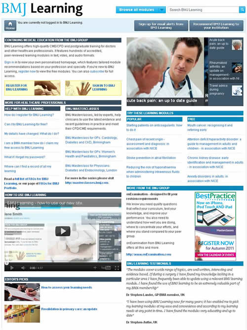
The new BMJ Learning site launched at the end of September, with a major redesign. It’s the result of a year of work from developers, editors, and marketing staff, and represents one of the leading online destinations for continuing medical education.
The most obvious change is a fresher look, which, as well as being visually appealing, reflects modern thinking about web design, with an emphasis on accessibility and usability. The new site is also much more dynamic, with lists of popular modules updating to reflect how visitors are using the site, and editor’s picks covering topical issues such as revalidation.
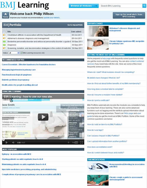
 BMJ Learning and BMJ Portfolio are now much more tightly integrated, making it easier for medical professionals to track what they’ve learned, either for their own records of for use in an appraisal. Once any module is started, it’s automatically added to the user’s portfolio. Users can drop in and out of the module at any time and have their place saved, and return to retake modules or print certificates at any time. There’s also an ‘add to portfolio’ button, to save modules for later.
Another major change is personalised content. All users of BMJ Learning now have their own personal homepage, which automatically recommends modules based on their profession and medical specialty.

An important but less obvious improvement is the way the site handles accreditation. With several organisations recognising and accrediting BMJ Learning’s educational modules, users can now choose which system of CME/CPD points to use, either on a universal basis in their portfolio settings, or on a module-by-module basis as they download a certificate.
It’s always hard to know how a website’s users will react to a redesign, and seeing people get to grips with the site was an important part of the development process. During the testing phase, the development team sat in a soundproof room, watching from behind a two-way mirror as GPs and medical students logged on to an early build of the site. The set-up was reminiscent of an interrogation scene in a spy thriller, but in fact took place at a market research company in St Albans.
It was heartening to see most people quickly get used to the new design, and users reacted well to the idea of personalised content. We made improvements to reflect the difficulties a few users had, and for the people who still need a bit of help, we produced a video guide to all the new features (see below).
http://www.youtube.com/watch?v=mtNG1zBq2jg
Registering for a BMJ Learning account is quick and simple, and many of the modules on the site are free to access. Why not take a look at http://learning.bmj.com? And if you have any comments about the site, we’d be delighted to hear your thoughts.
by Philip Wilson, Web Editor, BMJ Learning