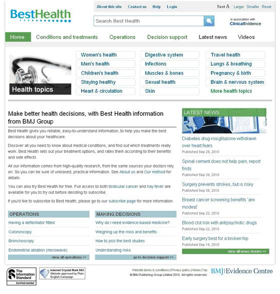
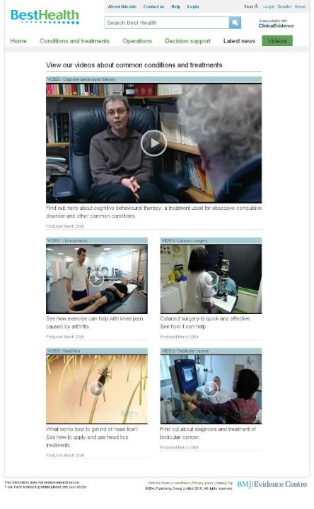
Newly launched Best Health website
30 Sep, 10 | by BMJ
by Anna Sayburn, Senior editor, Best Health, asayburn@bmjgroup.com
How many people know that the BMJ Group’s Evidence Centre produces a high quality, evidence-based health information service, aimed at consumers? Probably not enough, which is one reason we want to make a noise about the newly launched Best Health website. Best Health grew out of the clinical products produced in the Evidence Centre. Originally the website was designed as a ‘translation’ of the Clinical Evidence site, intended for patients to use with their doctors.
The design process
Over recent years, we’ve added a weekly news service, produced podcasts and videos, and written printable summary leaflets for all our in-depth conditions. This new material was sent to our corporate clients for use on their own websites (you may have seen news stories on The Guardian or Boots websites). Until now, we’ve been unable to showcase them on our own site. However, we wanted to do more than add new material. We were aware that the home page had become quite wordy, and the design needed freshening up. We’d also had feedback that some readers found navigation difficult and the structure didn’t always seem logical.
Finally, we’ve spent the last year re-engineering our XML, making it more flexible for customers and allowing us to pull out and highlight different sections of our content as we wished. This meant we needed to rebuild the website anyway, so we took the opportunity to make all the changes we’d long wanted to make. It was the first time I’d worked on a website re-design, and the brief from the technical team was to start from scratch. We began by pulling together all the feedback we’d had from readers about the site design, and the user experience. I reviewed it to find common themes. One surprisingly simple point was that some readers found our basic font too small, and wanted an obvious way of adjusting text size. Others had found themselves in cul-de-sacs, on pages without sufficient navigation to get back to where they’d started from.
We handed all this over to the designers, and I came up with some proposals for wire frames, based on a number of use cases. We then had the job of translating the use cases into user stories for the requirements document, so that the technical team could begin work. We met weekly, thrashing out problems as they arose. Elin Svensson managed the project, ably liaising between the technical team (led by Keith Marshall) and the editors. It was exciting to see the first designs for the site – clean, crisp and with plenty of white space.
The results
Some subtle changes made a great difference to the site. Our ‘further information’ pages, formerly treated as generic sidebars leading off standard pages, can now be grouped together and highlighted in the navigation, allowing us to surface some useful content that had been buried on the previous site. We’ve applied the new group search, which is a massive improvement on our previous search functionality. And not only can we display our news stories; we can now link them to our in-depth information on specific topics, and if you look at a specific condition, you can see the relevant news stories attached. Small changes, but they help the site look up to date and relevant.
I’m particularly pleased that we have a good platform to show our health information videos, which range from how to deal with head lice, to what you can expect after a diagnosis of testicular cancer. We hope that they’ll attract more interest, enabling us to get funding to produce more videos. The site is partially behind a pay wall, for our institutional and individual subscribers. It’s freely available within BMA House, and if BMJ staff would like out of office access, they can contact me for a password.
We hope the site will provide an enhanced experience for existing and future subscribers, and also act as a showcase to demonstrate the breadth and quality of the consumer services we provide at BMJ Group. Do take a look at http://besthealth.bmj.com and let us know what you think.

