Refugees are often barred from conventional modes of transport, and thus reduced to using unsafe means of travel. But people who are running away from horrible risks are willing to take quite extreme risks. Or as stated by the somalian-british poet Warsan Shire “you have to understand that no one puts their children in a boat unless the water is safer than the land” (from her poem Home, you can read it in fulltext here or hear the author read it herself here).
We’ve seen this over the last few years, when ever-increasing numbers of desperate people attempt to reach Europe, pushed by a number of converging factors (war in Syria, conflicts in Afghanistan and Nigeria, repressive regime in Eritrea – and overfull refugee camps, and instability in Libya, which has previously harboured many refugees). Europe is by no means the most common destination for refugees – millions are displaced within their own countries or harboured in neighbouring countries, often under very difficult conditions – but Europe is the most dangerous destination for clandestine migrants globally, according to the International Organization for Migration.
I’ve been looking for some comprehensive overview of mortality of the refugees entering Europe. There is a lot of data available online, but I couldn’t find any summary of mortality in relation to how many refugees are arriving. So I downloaded some of the available data and made some calculations and graphs, for my own understanding, and now sharing it with you. As always, please let me know if you find some factual errors or missing information (but complete zero-tolerance for haters and demagogues!)
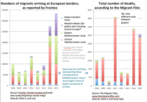
The graph below shows the numbers of arriving migrants side to side with number of deaths (=dead and missing-at-sea), by year and split by which route they arrived. (See extra information about the data at the bottom of this post.) Deaths so far in 2015 are a little over 3,000, of which about 2,800 died on the Mediterranean and about 200 died on European ground. The IOM states that 95% of deaths on the Mediterranean occur along the Central Mediterranean route (going from North Africa to Italy), which we also see here (the red fields). Though the numbers of migrants are the highest in 2015, deaths are lower than in 2011, which is also a conclusion of the latest newsletter of the Migrant Files. This should mean that the overall mortality rate (per number of migrants) is going down. In the left graph, we also see that the safer, Eastern route has increased it’s share in 2015 (as far as I understand, partly from geopolitical reasons). So, have the mortality rates declined per route, or has the overall rate declined because the routes have shifted?
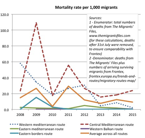
I then computed mortality rates (graph below) based on the two different sources presented above. Combining different sources in this way is of course a risky business, in case they are based on different definitions or such. Or error sources could differ across time for the two sources. For instance, it’s possible that more migrants passed undetected in the earlier years, when Frontex had less resources – but of course, for the same reasons, more deaths could also have been undetected.
Bearing in mind that there are several possible sources of error for the graph below, I still think the graph shows a relevant story. Mortality is indeed down hugely compared to 2011, for all routes and especially for the Central Mediterranean route. Mortality on the Western Mediterranean route (from Morocco to Spain) has kept decreasing. But from 2012 onwards, mortality rates for the most dangerous route, the Central Mediterranean seem to remain roughly the same, despite the large rescue operations. This graph only goes up to July 2015, and the Migrant Files state that mortality rate during June-August has been the lowest since start of data collection, so it’s possible that the graph will change when all of 2015 is included.
The available data is a bit fuzzy still regarding the causes of death (many cases are unclear, so it’s hard to make an overview). For the deaths on the Mediterranean, drowning is one major cause of death of course, while others have suffocated below board or died from dehydration or exhaustion; also some deaths due to fall injuries after being pushed (accidentally or intentionally) and at least two cases of death during childbirth. For the deaths on land during 2015, suffocation seems to dominate (largely inside trucks during transport), followed by traffic related causes – including people hiding under trucks or similar to cross borders, and being crushed after losing their grip – and exhaustion/dehydration and similar. For previous years, violence and suicide also play a significant role.
Data collection and research on vulnerable, hard-to-reach populations is extremely difficult. The data on deaths I used here have been painstakingly compiled from multiple sources by a group of obviously hardworking journalists; and the data on arrivals are based only on those who are registered. (See more details on data at the bottom of the post.) Both deaths and number of migrants are likely to be underestimated – and the incidence rate of non-fatal injuries remains unknown, along with other information that is vital both for humanitarian efforts and decision-making at the top political level. Maybe some organization could reach out to the refugees and crowdsource information about health, injuries and needs from those who know it best, using for instance a tool like Ushahidi? Refugees and aid workers along the routes have phones, all that would be needed is a central initiative to coordinate and validate the data. And the refugees crossing the mediterranean could maybe be tracked using cell phone data, like one research study did in Haiti, and which is now done at the Flowminder foundation.
For added understanding of the circumstances, turn to professor Hans Rosling:
…and for added understanding of the human side, I share a video from #helpiscoming. But you should have some tissue paper close at hand if you watch it.
About the sources:
Number of deaths are available from at least two sources, the Missing Migrants Project of the International Organization for Migration, and the Migrant Files (the latter is a project from a European consortium of journalists). The method of data compilation seems quite similar between the two sources (combining reports from rescuers, rescued, and media). In many cases of boats rescued at mid-sea, they only know the number of missing, and have no actual dead bodies, which mean that the numbers presented here represent “dead and missing”. The IOM numbers are marginally more conservative, but the difference is small. Since the IOM only has data for 2014 and 2015, I chose to use the data from the Migrant Files. The data is available as a spreadsheet from their site; I downloaded it, cleaned up the categorizations of routes, and summed it up by year, so you won’t find these exact numbers on their site.
I picked the data on arrivals from Frontex, the EU border authority. If you follow the link, data from 2015 are available in the map, and data and metadata for previous years are available per route if you click the arrows in the map. The arrivals along the Western Balkan route is a combination of people who already arrived via the Eastern Mediterranean route, and people arriving across land. So some of those who first came across the Eastern Mediterranean might be registered twice.

